Bootstrap was developed in August 2011 by Mark Otto and Jacob Thornton at Twitter, and released as an open source product on GitHub.
you can find bootstrap on GitHub On that link TWBS_BootStrap
and you can find bootstrap here getbootstrap.com
To start using Bootstrap on your own web site. Download Bootstrap from getbootstrap.com or Include Bootstrap from a CDN
The first basic class of
a fixed width responsive website should be wrapped in .container (or just the content without menu, whatever - it's up to you)
.container can't be nested!
and other one is
a full screen website should be wrapped in .container-fluid
.container-fluid can't be nested!
Exmple
must be within .container to ensure correct padding and alignment
only columns (block elements with width classes) may be immediate children of rows
sets margin-left and margin-right: -15px
Bootstrap's grid system is responsive 12 column system controled by two classes .row and .col
for example you can see
Result
Are you thinking what is sm ?
ans. We have four classe to make responsive grid system with diffrent screen size.
xs (for phones - screens less than 768px wide)
sm (for tablets - screens equal to or greater than 768px wide)
md (for small laptops - screens equal to or greater than 992px wide)
lg (for laptops and desktops - screens equal to or greater than 1200px wide)
here are some other use full classe
.pull-right
.pull-left
sets float to either left or right
.center-block
sets margin-left and margin-right to auto
Example
here is some more table classes
may not work if placed in a floating element!
Example


.jpg)
Result
Example
Example
here is code example
Result
Result
Result
Collapsible panel
just chang the class nav-tabs to nav-pills
Result
what do you need a black navigation just replace .navbar-default class into .navbar-inverse and you can see this
.form-group
when creating vertical forms, it's a class for its wrapper (mostly div) of each label and its input, adds some margin-bottom
.form-control
for every form element (input, textarea...), gives it 100% width
to make it narrower, use a narrower wrapper (row and col-*-* divs)
.form-control-static
for a paragraph that replaces a form element (input...)
.form-horizontal
for horizontal forms where label is on the same line as input
you have to use column classes (like col-xs-10) for each label and its input (or whateveer it is)
still combined with .form-group wrapper and .form-control classes
.form-inline
for a single line form (but still vertical on extra small screens)
often used with the placeholder attribute to not need labels
labels of inline forms should get .sr-only class to be positioned so that they can't be seen (but they won't get display: none or visibility: hidden property)
code example
Result
media-left, media-right, media-object, media-body, media-heading
lets uss all of them and create comment box
Result


modal fade
modal-dialog
modal-content
modal-header
modal-title
modal-body
modal-footer
code example
Result
we are going to just make a navbar affix in top 16000 because our article is too long lets scroll and see result
code example
and you can find bootstrap here getbootstrap.com
To start using Bootstrap on your own web site. Download Bootstrap from getbootstrap.com or Include Bootstrap from a CDN
The first basic class of
.container
sets fixed width to an element (which changes depending on a screen size to other fixed values, so it's still responsive) on all screen sizes except xs - on xs, the width is calculated automatically (this behaviour can be changed)a fixed width responsive website should be wrapped in .container (or just the content without menu, whatever - it's up to you)
.container can't be nested!
and other one is
.container-fluid
sets 100% width, margin-left and margin-right: auto, padding-left and padding-right: 15pxa full screen website should be wrapped in .container-fluid
.container-fluid can't be nested!
Exmple
  <div class="container-fluid">

</div>
      <div class="container">

</div>
.row
creates horizontal groups of columns (which usually have width classes, see below)must be within .container to ensure correct padding and alignment
only columns (block elements with width classes) may be immediate children of rows
sets margin-left and margin-right: -15px
Bootstrap's grid system is responsive 12 column system controled by two classes .row and .col
for example you can see
<div class="row">

    <div class="col-sm-4">.col-sm-4</div>

  <div class="col-sm-4">.col-sm-4</div>

   <div class="col-sm-4">.col-sm-4</div>


  </div>
Result
.col-sm-4
.col-sm-4
.col-sm-4
ans. We have four classe to make responsive grid system with diffrent screen size.
xs (for phones - screens less than 768px wide)
sm (for tablets - screens equal to or greater than 768px wide)
md (for small laptops - screens equal to or greater than 992px wide)
lg (for laptops and desktops - screens equal to or greater than 1200px wide)
here are some other use full classe
.pull-right
.pull-left
sets float to either left or right
.center-block
sets margin-left and margin-right to auto
.lead Makes a paragraph stand out.small Indicates smaller text (set to 85% of the size of the parent).text-left Indicates left-aligned text.text-center Indicates center-aligned text.text-right Indicates right-aligned text.text-justify Indicates justified text.text-nowrap Indicates no wrap text.text-lowercase Indicates lowercased text.text-uppercase Indicates uppercased text.text-capitalize Indicates capitalized text.initialism Displays the text inside an element in a slightly smaller font size.list-unstyled Removes the default list-style and left margin on list items (works on both <ul> and <ol>). This class only applies to immediate children list items (to remove the default list-style from any nested lists, apply this class to any nested lists as well).list-inline Places all list items on a single line .dl-horizontal Lines up the terms (<dt>) and descriptions (<dd>) in <dl> elements side-by-side. Starts off like default <dl> s, but when the browser window expands, it will line up side-by-side.pre-scrollable Makes a <pre> element scrollable.table
table classe have light padding and horizontal dividers.Example
| Column1 | Column2 | Column3 |
|---|---|---|
| ABC | XYZ | edututor.in |
| ABC | XYZ | edututor.in |
| ABC | XYZ | edututor.in |
here is some more table classes
.table-striped
| Column1 | Column2 | Column3 |
|---|---|---|
| ABC | XYZ | edututor.in |
| ABC | XYZ | edututor.in |
| ABC | XYZ | edututor.in |
.table-bordered
| Column1 | Column2 | Column3 |
|---|---|---|
| ABC | XYZ | edututor.in |
| ABC | XYZ | edututor.in |
| ABC | XYZ | edututor.in |
.table-hover
| Column1 | Column2 | Column3 |
|---|---|---|
| ABC | XYZ | edututor.in |
| ABC | XYZ | edututor.in |
| ABC | XYZ | edututor.in |
.table-condensed
| Column1 | Column2 | Column3 |
|---|---|---|
| ABC | XYZ | edututor.in |
| ABC | XYZ | edututor.in |
| ABC | XYZ | edututor.in |
.table-responsive
| Column1 | Column2 | Column3 |
|---|---|---|
| ABC | XYZ | edututor.in |
| ABC | XYZ | edututor.in |
| ABC | XYZ | edututor.in |
Some classes for img tag
.img-rounded
.img-circle
.img-thumbnail
.img-responsive
img-responsive class that makes any image responsive (scaling to the parent element) as it has max-width: 100% and height: automay not work if placed in a floating element!
Example
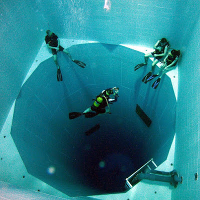
The World's Deepest Swimming Pool
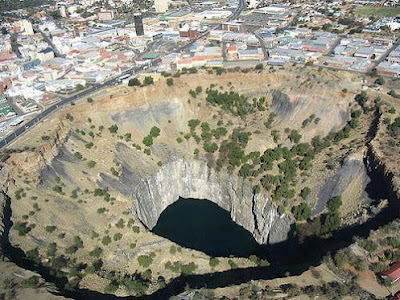
The largest ever hand-dug excavation in the world
The Heart River is a tributary of the Missouri River
Class .jumbotron create a big box with grey color for calling extra attention to content. It also enlarges the font sizes of the text inside it
Example <div class="jumbotron "> Hello Reader </div> Result
Hello Reader
.well class adds a rounded border around an element with a gray background color and some padding:
Example
I am well Normal
Alert Class is use with four contextual classes
.alert-success, .alert-info, .alert-warning or .alert-danger Example
Success! Indicates a successful action.
Info! Indicates a informative action.
Warning! Indicates a warning.
Danger! Indicates a dangerous action.
.btn class
we have following style of button classes
.btn

.btn-default

.btn-primary

.btn-success

.btn-info

.btn-warning

.btn-danger

.btn-link

.btn-group

.btn-group-vertical

.btn-group-justified
glyphicon we have 260 glyphicons from the Glyphicons Halflings set
how to use themExample
<span class="glyphicon glyphicon-name"></span>
.pagination
used for creat paging genraly used with ol ul tageshere is code example
 <ul class="pagination">

  <li><a href="#">1</a></li>

  <li><a href="#">2</a></li>

  <li><a href="#">3</a></li>

  <li><a href="#">4</a></li>

  <li><a href="#">5</a></li>

</ul>
Result
.pager
pager is as same as pagination insted of squir block it provied button loock when you change the class pagination to pager you can see this type of result.panel
panel class is used to create box around content like .well but it have sub classes to use like panel-default, panel-heading, panel-body, panel-footer etc, here is the code to see example
 <div class="panel panel-default">

       <div class="panel-heading">Panel Header </div>

       <div class="panel-body">Panel Content </div>

       <div class="panel-footer">Panel Footer </div>

 </div>
Result
Panel Header
Panel Content
.collapse
the class .collapse is used to achive functionnality of toggler when we want to show hide data on click previus days we achive that by writing java script but now days with bootstap we add .collapse class as follows
 <a data-toggle="collapse" href="#collapse1">Collapsible panel </a>


 <div id="collapse1" class="panel panel-default">

       <div class="panel-heading">Panel Header </div>

       <div class="panel-body">Panel Content </div>

       <div class="panel-footer">Panel Footer </div>

 </div>
Result
Collapsible panel
Panel Header
Panel Content
.nav-tabs and nav-pills
bouth classes can be used with ul tag here is the example how to use
<ul class="nav nav-tabs">

  <li class="active"><a href="#">Home</a></li>

  <li><a href="#">Menu 1</a></li>

  <li><a href="#">Menu 2</a></li>

  <li><a href="#">Menu 3</a></li>

</ul>
result just chang the class nav-tabs to nav-pills
.navbar
Navigation bar is essiancel for any website we can get good navigation menu from using following classes
navbar navbar-default

navbar-header

navbar-brand

nav navbar-nav
Let's create a code to use all those classes
<nav class="navbar navbar-default">

  <div class="container-fluid">

    <div class="navbar-header">

      <a class="navbar-brand" href="#">WebSiteName</a>

    </div>

    <ul class="nav navbar-nav">

      <li class="active"><a href="#">Home</a></li>

      <li><a href="#">Page 1</a></li>

      <li><a href="#">Page 2</a></li>

      <li><a href="#">Page 3</a></li>

    </ul>

  </div>

</nav>
Result
what do you need a black navigation just replace .navbar-default class into .navbar-inverse and you can see this
Forms' Classes
don't forget that even form elements can be in the Bootstrap grid, so don't be afraid to use .row inside a form and then col-*-* wrappers.form-group
when creating vertical forms, it's a class for its wrapper (mostly div) of each label and its input, adds some margin-bottom
.form-control
for every form element (input, textarea...), gives it 100% width
to make it narrower, use a narrower wrapper (row and col-*-* divs)
.form-control-static
for a paragraph that replaces a form element (input...)
.form-horizontal
for horizontal forms where label is on the same line as input
you have to use column classes (like col-xs-10) for each label and its input (or whateveer it is)
still combined with .form-group wrapper and .form-control classes
.form-inline
for a single line form (but still vertical on extra small screens)
often used with the placeholder attribute to not need labels
labels of inline forms should get .sr-only class to be positioned so that they can't be seen (but they won't get display: none or visibility: hidden property)
code example
<form action="/action_page.php">
<div class="form-group">
<label for="email">Email address:</label>
<input type="email" class="form-control" id="email">
</div>
<div class="form-group">
<label for="pwd">Password:</label>
<input type="password" class="form-control" id="pwd">
</div>
<div class="checkbox">
<label><input type="checkbox"> Remember me</label>
</div>
<button type="submit" class="btn btn-default">Submit</button>
</form>
Result
.media
media class is used for blog comments, tweets, chat box etc. following are m classesmedia-left, media-right, media-object, media-body, media-heading
lets uss all of them and create comment box
<div class="media">

  <div class="media-left">

    <img src="img_avatar1.png" class="media-object" style="width:60px">

  </div>

  <div class="media-body">

   <h4 class="media-heading">John Doe</h4>

    <p>Lorem ipsum...</p>

  </div>

</div>


<div class="media">

  <div class="media-body">

    <h4 class="media-heading">John Doe</h4>

    <p>Lorem ipsum dolor sit amet, consectetur adipiscing elit, sed do eiusmod tempor incididunt ut labore et dolore magna aliqua.</p>

  </div>

  <div class="media-right">

    <img src="img_avatar1.png" class="media-object" style="width:60px">

  </div>

</div>
Result
John Doe
Lorem ipsum...John Doe
Lorem ipsum dolor sit amet, consectetur adipiscing elit, sed do eiusmod tempor incididunt ut labore et dolore magna aliqua.
.modal
All modal classes provide good loocking popup modals lats use following modal classesmodal fade
modal-dialog
modal-content
modal-header
modal-title
modal-body
modal-footer
code example
<button type="button" class="btn btn-info btn-lg" data-toggle="modal" data-target="#myModal">Open Modal</button>


<div id="myModal" class="modal fade" role="dialog">

  <div class="modal-dialog">


    <div class="modal-content">

      <div class="modal-header">

        <button type="button" class="close" data-dismiss="modal">×</button>

        <h4 class="modal-title">Modal Header</h4>

      </div>

      <div class="modal-body">

        <p>Some text in the modal.</p>

      </div>

      <div class="modal-footer">

        <button type="button" class="btn btn-default" data-dismiss="modal">Close</button>

      </div>

    </div>


 </div>

</div>
Result
affix
affix plug-in fixed anything at specific position and make it sticky lets understand with examplewe are going to just make a navbar affix in top 16000 because our article is too long lets scroll and see result
code example
<nav class="navbar navbar-inverse" data-spy="affix" data-offset-top="9000">

  <ul class="nav navbar-nav">

    <li class="active"><a href="#">affix Topnav</a></li>

    <li><a href="#">Page 1</a></li>

    <li><a href="#">Page 2</a></li>

   <li><a href="#">Page 3</a></li>

  </ul>

</nav>


note you have to create .affix css class  top 20px; z-index9999;


.jpg)
No comments:
Post a Comment